Don't Be Afraid to Leave Some Space
Taking a breath of fresh air can be reinvigorating, both mentally and physically. The same is true when someone is viewing social media, looking at a website, or walking around looking at signs and posters. It is important to give viewers that breathing room when creating. Negative space is often called "white space" but by no means does it need to be white, it can be filled with color, texture, anything really -- which is why I will refer to it as negative space. Ask any graphic designer and he/she will have a plethora of stories centered around times where their designs became more crowded by client's feeling that negative space was a "waste" of space. All too often companies want to fill that space to get more information across, but it can actually be detrimental to messaging.
Poster Blindness (Selective Disregard)
Poster blindness has many different names depending on what industry you find yourself in, the technical term is selective disregard, and it is something that heavily influences the way that people interact with the world around them. Yet, this term isn't often discussed outside of the worlds of graphic design, marketing and environmental design, and psychology. The idea is that people do not actually perceive all the information that is taken in by the various senses because our brains want to limit the amount of work it does. This means that a good percentage of the world that surrounds you doesn't reach your consciousness, and knowing this is very important when you are trying to stand out. One poster amongst many does not call attention to itself unless its design stands out distinctly from the others around it. It is better to have one poster by itself to call more attention to it. The same can be said for the amount of content presented on a website, or on a social post. If you have too much information without enough negative space to allow more attention to be drawn to the important content, your message might be missed.
Impact
The more things that are near each other means that each piece stands out less individually. In order for a piece of content to have the most impact, it must draw attention to itself and the easiest way to do that is to allow it to have as much breathing room as possible. You see this a lot in the marketing world. Billboards often have a short sentence and just one image or lots of blank space, because they know that people driving by have limited time to perceive the billboard, actually read it, comprehend it, and react to it. If you want someone to remember a key message, then it is best to present it without much surrounding it.
Choices
Whilst good design will ideally lead the eyes of the audience and guide them where to look, with every added item to look at, you are making the viewer make more of a decision as to where to look and what to read. Anytime someone is presented with more than one or two options, the time it takes for someone to make a decision increases, and if someone takes too long to do something they will usually give up on it.
If too much information is presented to an audience, whether it be visual/graphic or textual information, the likelihood of someone actually viewing it, comprehending it and remembering it decreases. This is why negative space is so important. Use it to frame things of importance, use it to give your audience a mental break, just don’t forget to utilize this great tool.
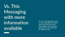
Both of these examples shown utilize negative space, but one has more. The hard part about negative space is finding the balance, too much and you are losing the opportunity to provide further info, but having too little is detrimental to the viewer’s ability to remember key information. When deciding to add more information or not, always think if it will do more harm than good before adding it.


