Branding

Icons & Brand Voice
From products and services to hobbies and interests, icons are a great way to communicate information. Icons are usually seen on websites and in apps, but a well-designed set of icons can be as much a part of a brand as a logo. Just like any other visual element, icons should convey the tone of a brand while communicating an idea, but that is easier said than done. Every single part of an icon can change its overall personality, just like a logo, but the major characteristics to focus on for branding are its roundedness, complexity, and content.
Icon Styles
Before getting into more of the nitty-gritty, understanding the most popular styles of icons is important. The two main types are line art icons and flat vector icons. Line art icons are made of lines, also called strokes and flat vector icons are made of colored shapes, and each shape only has one color in it. Both of these styles can successfully communicate ideas and fit into most any brand, so be sure to consider both carefully before deciding which one to choose for a brand.
[caption id="" align="alignnone" width="1591"]

Flat icons, like the one on the left, utilize colors and solid objects to create more complex shapes, but do not use gradients, only a single color per shape. Line art icons utilize only strokes to create the shape. Line art icons can use many color strokes in the same icon. The compass rose on the right is an example of an icon that utilizes both of these styles, so they don’t have to be mutually exclusive. [/caption]
Icon Roundness
The roundedness of an icon can easily take an icon that is otherwise friendly and approachable, and turn it into a modern and edgy icon. Roundedness doesn't refer to the overall shape of an icon, but rather how the end of a line is treated, how corners are treated, and if lines are perfectly geometric or not. One of the easiest ways that an icon can change its personality is to have a different stroke cap, or having its line end in a different way. The two major stroke caps are butt caps and rounded caps, and all that means is at the end of a line it either has a curved end or a straight line.
If the brand is more on the friendly/approachable/kind/young spectrum then choosing something with rounded caps will lean towards that. Corners also have the two options of being rounded or pointed, this is another way to communicate softness or hardness. Not all icons have strokes or solid shapes, so these choices depend on what kind of icon it is, so when choosing an icon be sure to consider what is applicable.
[caption id="" align="alignnone" width="627"]
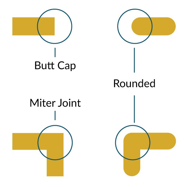
Butt caps end strokes in a straight line which lends more towards an angular, geometric, or edgy icon. The Miter joint makes all corners have a sharp appearance and makes an icon very geometric and angular. Both corners and caps can be rounded which leads to a very soft feeling icon. Combining different caps and corners can lead to different personality traits of an icon, experimenting is great! [/caption] [caption id="" align="alignnone" width="1095"]

Here are two icons that have the exact same content and style with the only difference being the stroke ends and corners, and yet these two icons give off very different impression. This is the power of stroke caps and corners! [/caption]
Icon Complexity
Icon complexity has many different factors and many different levels, but only two will be addresed here which are color and detailing. Having more color or detailing can be tricky because it limits the sizes at which it is recognizable. When there is more complexity at smaller sizes, icons tend to become blobs. If the environment the icon is in tends to be viewed from afar, or at many different sizes it is usually better practice to choose icons that are simpler so that they can be better understood. Simpler icons would also be great if the brand is minimalist or very clean.
Color is a huge part of visual branding, and if the icons are being custom designed, utilizing brand colors and their variants is usually the best route to go. When budget or time forces you to use stock icons, pull out that handy brand guideline and study the color palette. If a brand has a wide range of colors, or many variants, choosing icons that use a lot of color could fit in well, but if the brand has only 1 or 2 major colors, choosing black or gray might serve you better.
[caption id="" align="alignnone" width="2645"]

These 5 icons utilize a variety of complexity, both in line use and color use. This can be one of the hardest choices to align to a brand, but just read the brand descriptors and see which fits best. [/caption]
Icon Content
Now comes the last and probably most important part of an icon, the content. What it is actually depicting?
More often than not an icon is as close to an accurate depiction of exactly what it is trying to convey, e.g. a phone for phone. That is great for communicating the idea easily, but if a brand is playful, eccentric, and especially fun, choosing another route could bolster the brand's voice. Choosing to depict something slightly different, or using a visual pun can instantly help the mood of an icon.
This can be hard to do because an icon should be easily recognizable, but if the icon is accompanied by written content, e.g. a website page, email marketing, brochure, etc., then it doesn't have to be immediately recognized as the other content can clarify and the main goal of the icon is to grab attention.
[caption id="" align="alignnone" width="1818"]

Here is a good example of content choice in an icon that can impact the brand voice. These icons all get at the idea of video, but each allows for a different tone of voice when referring to video. Does your company want to be modern with a fancy tv set up, or quirky and retro hipster with an old tv, or more geometric but straightforward with a play button? One option is more humorous, one is very stylistic and artistic, and the other choice is rich, modern and clean. [/caption]
Conclusion
If you can masterfully combine roundness, complexity and content to fit your brand, you will be guaranteed to have a set of icons that will help your marketing materials stand out. But this is no easy task which is exactly why they make you stand out from the visual crowd. If you can hire a professional like us to create icons, you’ll have a lot less to worry about -- but if your budget only allows for stock icons, check out www.flaticon.com and www.iconfinder.com to purchase some very well designed stock icons.
Just remember, when selecting your icons, don’t focus on which ones you think are the ‘coolest’ and instead focus on how well they fit into your brand and why.
