RGB vs. CMYK vs. PMS: What’s the difference and where should I use them?
If you have done any kind of design for digital or print, you’ve used colors within RGB, CMYK or PMS color profiles. Even if you didn’t know what the acronym meant or the ideal location to use them. Let’s take a look at each of these color profiles and what they are used for.
RGB
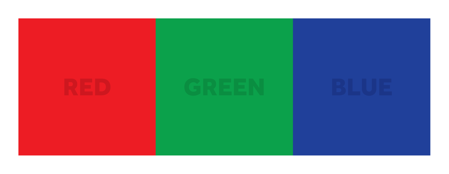
RGB stands for Red, Green, Blue. RGB color profiles are used exclusively for digital design. They represent the same colors used on your computer, smartphone or TV screen. Each color is created by projecting against a screen using light. Essentially light filters through these colors to make different hues or tones. 100% light density creates white. On the contrary, 0% density creates black (which is the color of your screen). Using a light density from 1 – 99% with different variations of these three colors will create any of the other colors you see on your screen. There is typically some variation in RGB colors from screen to screen as monitors are each calibrated a bit differently. For printing, all RGB colors will need to be converted to CMYK.
CMYK
CMYK should be used when creating designs for print applications. Cyan, Magenta, Yellow, and Key (black) make up the color palette for CMYK. This is often referred to as a four-color process as it uses four different colors of inks to create all of the color variations. Your printer at home will use this color profile. Each specific color is created by mixing a blend of Cyan, Magenta, and Yellow. The reason black is referred to as “key” is because it is the color used on the key plate, which supplies the contrast and detail on a final image. Within this process, white is created from the paper on which the design is printed. Because CMYK colors are mixed during the printing process, colors can vary slightly on various printers or throughout a printing run. Although this is not usually noticeable, it is something to keep in mind when printing designs with very specific colors, i.e. logos or branding elements.
PMS
PMS stands for Pantone Matching System. PMS is a universal color matching system used primarily for printing. Each color is represented by a numbered code. Unlike CMYK, PMS colors are pre-mixed with a specific formula of inks prior to printing. Similar to picking out your favorite paint at the hardware store before painting. Having these specific formulas creates the most consistent color possible across different applications or print locations. If you will be printing anything with a very specific color palette this is the best color profile to use.
Before you start your next design make sure you are setup in the right color profile for the job. Or better yet, let us help. Drop us a line!


