How to Create Consistent Photo Content
Facebook recently announced a significant change to the platform’s reach algorithm. While the site previously rewarded page posts that registered high user engagement figures, future posts will see an increase in potential reach as a result of user time spent.
What does this mean for social media managers on Facebook? Photo and video content will be more important than ever to reach your intended audience. Remember, a picture is worth a 1,000 words and is more likely to capture interest than a boring text status or an external link.
The best way to harness this visual power is to create editing rules for each photo used. Designing consistent images will help your audience identify your posts and capture their attention longer. This type of cohesion adds a professional look with minimal effort.
5 Top Tips
1.) Utilize photo EDITING software
It’s easy to create consistency from photo to photo by using the same filters or adjustments. If your brand utilizes Instagram and takes photos directly from a mobile device, VSCOcam and Squareready apps are helpful, free, and easy to use. Additionally, Pixlr and Canva are free photo editing websites that offer professional results for social media managers without a design background. Photoshop requires skill but also offers the most creative functionality for high quality results.
2.) The Importance of CENTERING
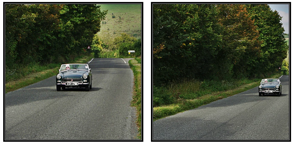
When composing your image keep your subject centered. This will automatically direct the viewer’s focus to the main point and keep the image and context clear. When taking photos, don't be afraid to step back and capture more of your image. Remember, it is much easier to crop a larger view down to size than to add extra sky with Photoshop.
3.) PLAY IT AGAIN
Stick with the same photo editing software, app, or website. Keep the same settings for specific content posts. Discuss with your team how you want your photos to look (filters, brightness/contrast, saturation, sharpness) and stick with them. Straying from consistency cause a loss of audience interest and result in a lower reach. This also applies to fonts, frames, and color schemes.
4.) different STROKES FOR different posts
While you need to be consistent in your filters, I recommend mixing up your edits for different post types. One way to do this is to utilize a black & white, or grainy filter for a #ThrowbackThursday post but edit your #MotivationalMonday photos to have more brightness and less contrast.
5.) WHAT'S UP WITH watermarks
The use of a watermark can differentiate your brand photos from those of your competitors. There are several ways to add them. PicMonkey is a free photo editing website that offers step by step instructions on their blog. As a friendly reminder, don't place your logo flush with the edge of the photo, provide ample space from the edge.
We want to hear from you! If you have additional tips or recommendations, tweet them to us @ThinPigMedia.

