Branding

We’ve been around color our entire life, but do we really understand basic color theory? Whether you are reading a magazine or following directions on the subway, color plays a major part in all of our daily activities. As designers this is a way we can express emotion, feelings or make things stand out. There are a multitude of applications that explain basic color theories but today we will look at two. The Color Wheel and Color Harmony.
THE COLOR WHEEL
The Color wheel is exactly what it sounds like, a circle of colors. The traditional color wheel is based on red, yellow and blue (the primary colors we were taught in grade school). However any color circle with a logically arranged pattern of colors can be considered a “Color Wheel”. Let’s look at three different variations of the color wheel.
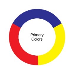
Primary Color Wheel
The three primary colors are red, yellow and blue. In traditional color theory these are the 3 colors that cannot be formed by mixing any combinations or other colors. All other colors are derived from mixing these three colors.
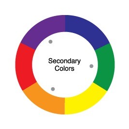
Secondary Color Wheel
Secondary colors form the next most basic of the standard color wheels. Mixing the three primary colors with each other forms these colors. For example yellow mixed with blue makes green or yellow mixed with red makes orange.
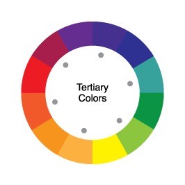
Tertiary Colors
This is where things start getting a little more interesting! Mixing a primary color with a secondary color forms a tertiary color. A tertiary color is a new hue that is expressed as a two-word name. For example, blue (primary) + green (secondary) = blue-green.
Now that we understand the most basic forms of colors, lets look at how those colors work together.
COLOR HARMONY
Although we might not be aware of it, things that are in harmony with each other constantly surround us. The way your car motor flawlessly runs or the way you mix ingredients in your favorite cookies. This is all a form of harmony. Merriam-Webster describes harmony as: a pleasing combination or arrangement of different things.
In the case of design, harmony is found when we organize colors in a way that is pleasing to our audience. Similar to the case of Goldilocks and the Three Bears, when we design something too boring (not enough color) or too loud (too much color) we can lose our audience. This is because the brain either becomes bored or is over stimulated to the point it can’t process. The goal is to utilize colors to make a piece that is both visually appealing and stimulating in a way that the brain can process. This is the “Just Right” area of color harmony. Lets take a look at colors that create a harmony.
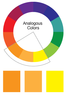
Analogous Colors
Analogous colors are any three colors organized by each other on a 12-color wheel. These colors usually work well together because of their similar hues. Many times in design we know a certain color we may want to work with. Analogous colors allow us to have variations of that color to create more visual interest.
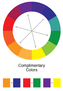
Complimentary Colors
Complimentary colors are any two colors that are directly opposite from each other on a 12-color wheel. In this case for example, purple & yellow, blue & orange, and red & green are all complimentary colors. These colors are often utilized when there needs to be a stark contrast within your design. Many sporting teams utilize complimentary colors for this reason.
Natural Colors
The colors we find in nature might not always fit into a technical version of a 12-color wheel but they are harmonious nonetheless. In the example below we can see how the green from the trees, provides a beautiful contrast from the blue water. While the orange we find in the flowers provides a pop of color.

Let us hear about your favorite color combination or palette.
