Let’s Talk Type
If one thing sets a designer apart, it’s their obsession with typography. There are plenty of memes about graphic designers who get handed a menu then spend more time critiquing the type setting than they do figuring out what they want to eat. Designers are taught to look out for a variety of things when it comes to type setting. With the ever increasing number of platforms available allowing social media managers to make their own content, I come across many type faux pas that could have been avoided. Here are two of the most important type settings to know:
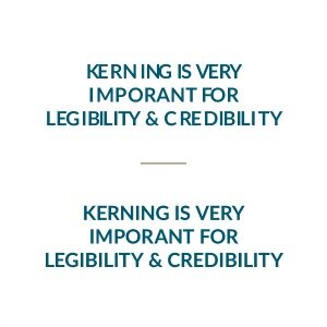
Kerning
Kerning is the space between two characters. Keeping the kerning between letters consistent can help with legibility, especially if the typeface is harder to read. It is also sometimes referred to as Letter Spacing in programs. Always use this tool to adjust the kerning so there aren’t large gaps between letters and to ensure the letters don’t run into one another.
Leading
Leading is the space between lines to type and is often referred to as Line Height or Line Spacing in programs. Leading is important to the flow of a body of text, especially when people are using a calligraphic or script style typeface. These have longer ascenders and descenders (parts of the type that go above or below the line of type) that risk running into other lines of type. For the clearest legibility, make sure there is enough leading between lines that the ascenders and descenders don’t go into the other lines of type.

Ensuring that these type settings are perfect won’t be the difference between the life or death of a business, but it makes marketing collateral look more professional, trustworthy, and easier for the customer to read. Paying attention to these details will make your company come across visually pleasing and appear more professional. Remember, we are only a call away if you would like assistance with your marketing.